flex布局:对齐弹性容器中的弹性项目
控制对齐的属性
justify-content - 控制主轴(横轴)上所有 flex 项目的对齐。
语法
1 | justify-content: flex-start|flex-end|center|space-between|space-around|initial|inherit; |
flex-start默认值。项目位于容器的开头。flex-end项目位于容器的结尾。center项目位于容器中央。space-between项目在行与行之间留有间隔(每一行中,第一项与起始点齐平,最后一项与终止点齐平,再将剩余空间平分作为行与行之间的间隔)。简单示例:|—|—|space-around项目在行之前、行之间和行之后留有空间(每行上面和下面的padding都一样) 简单示例:-|–|–|-initial将此属性设置为其默认值。请参阅 initialinherit从其父元素继承此属性。请参阅 inherit
align-items - 控制交叉轴(纵轴)上所有 flex 项目的对齐。
语法:
1 | align-items: stretch|center|flex-start|flex-end|baseline|initial|inherit; |
stretch默认值。元素被拉伸以适应容器。
如果指定侧轴大小的属性值为’auto’,则其值会使项目的边距盒的尺寸尽可能接近所在行的尺寸,但同时会遵照’min/max-width/height’属性的限制。center
元素位于容器的中心。
弹性盒子元素在该行的侧轴(纵轴)上居中放置。(如果该行的尺寸小于弹性盒子元素的尺寸,则会向两个方向溢出相同的长度)。flex-start
元素位于容器的开头。
弹性盒子元素的侧轴(纵轴)起始位置的边界紧靠住该行的侧轴起始边界。flex-end
元素位于容器的结尾。
弹性盒子元素的侧轴(纵轴)起始位置的边界紧靠住该行的侧轴结束边界。baseline
元素位于容器的基线上。
如弹性盒子元素的行内轴与侧轴为同一条,则该值与’flex-start’等效。其它情况下,该值将参与基线对齐。initial将此属性设置为其默认值。请参阅 initialinherit从其父元素继承此属性。请参阅 inherit
align-self - 控制交叉轴(纵轴)上的单个 flex 项目的对齐。
align-self属性指定弹性容器内所选项目的对齐方式。
注释:align-self属性将覆盖弹性容器的align-items属性。
align-content - 控制“多条主轴”的 flex 项目在交叉轴的对齐。
语法:
1 | align-content: stretch|center|flex-start|flex-end|space-between|space-around|initial|inherit; |
align-content属性修改flex-wrap属性的行为。它与align-items相似,但是它不对齐弹性项目,而是对齐弹性线。
注释: 必须有多行项目,此属性才能生效!
提示: 使用
justify-content属性可将主轴上的项目(main-axis)水平对齐。
单行垂直对齐
1 | .main { |
1 | <div class="main"> |
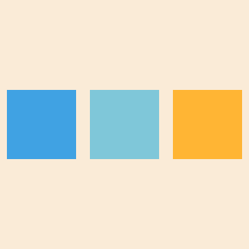
单行垂直居中 效果图:
多行垂直对齐
1 | .main { |
1 | <div class="main"> |
多行垂直居中效果图:

参考:
本博客所有文章除特别声明外,均采用 CC BY-NC-SA 4.0 许可协议。转载请注明来自 我欲乘风向北行!
相关推荐